ion-item
項目是可包含文字、圖示、頭像、圖片、輸入和其他任何原生或自訂元素的元素。項目僅應作為清單中其他項目的列使用。項目可以滑動、刪除、重新排序、編輯等。
基本用法
項目會靠左對齊文字,並且當文字寬度超出項目時會換行。我們可以使用 Ionic Framework 提供的 CSS 實用程式修改此行為,例如在以下範例中使用 .ion-text-nowrap。請參閱CSS 實用程式文件,了解更多可新增至項目以轉換文字的類別。
內容類型
清單中的項目雖然有多種形式,但通常支援 5 種不同的內容類型:支援視覺效果、文字、中繼資料、動作和控制項。但是,並非所有這些內容類型都應同時一起使用。以下指南顯示了不同的內容類型,以及如何在應用程式中正確使用它們。
支援視覺效果
支援視覺效果是裝飾性的圖示或其他項目裝飾。支援視覺效果的常見範例包括頭像、圖示和縮圖。由於此內容並非理解項目意圖的必要條件,因此通常會使用 aria-hidden="true" 從螢幕閱讀器隱藏。
如果視覺效果需要與項目互動,例如圖示按鈕,則視覺效果是動作而非支援視覺效果。
支援視覺效果應以一致的方式呈現。這會讓每個項目中的資訊更容易解析。
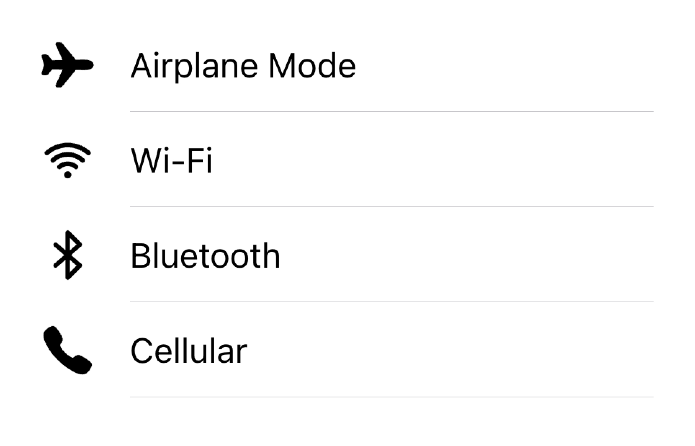
在清單中的同一側對齊視覺效果
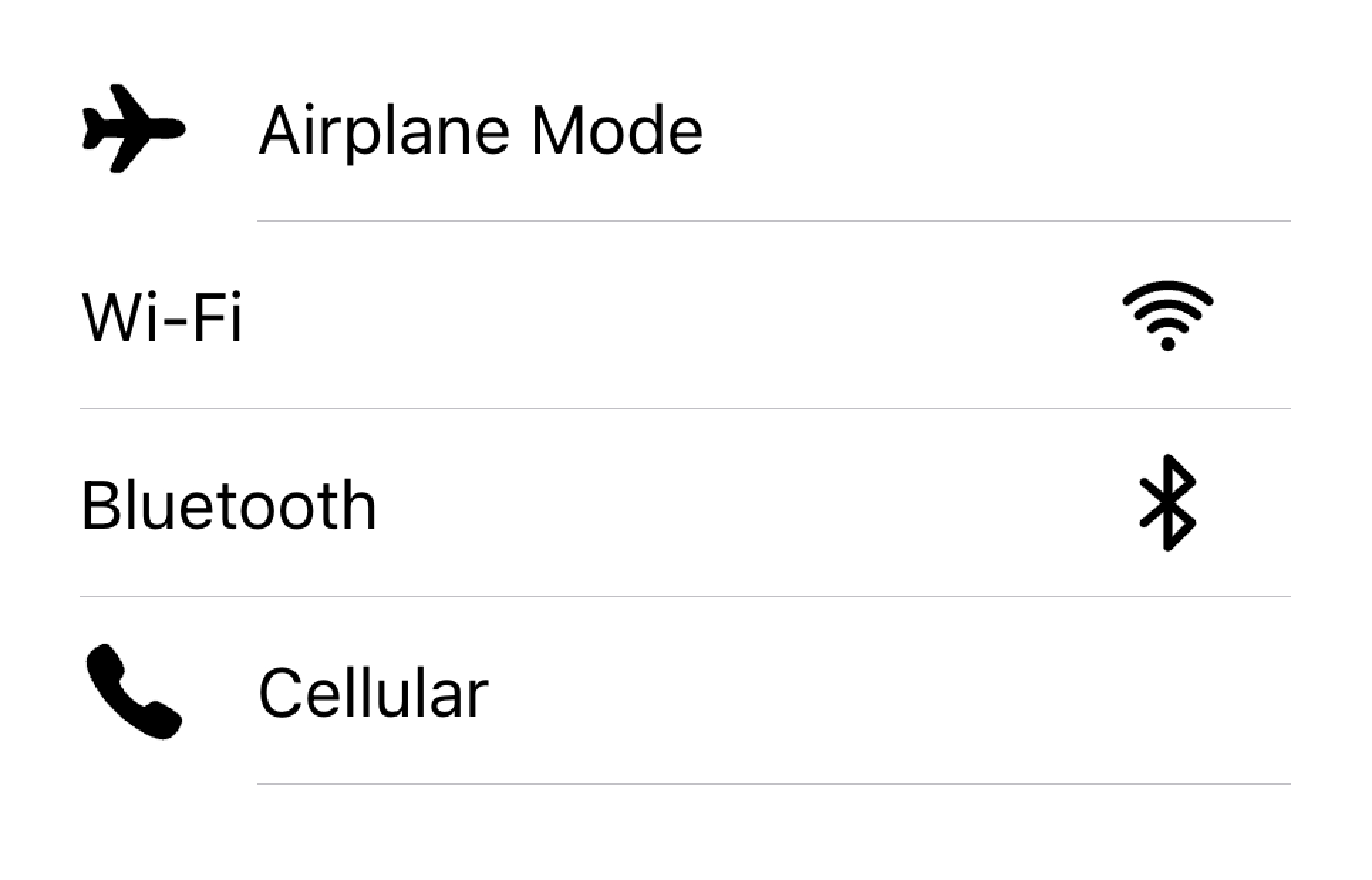
請勿在同一個清單中以不同的對齊方式呈現視覺效果
在以下範例中,我們正在建立兩個帶有支援視覺效果的清單。第一個清單使用圖示,第二個清單使用頭像。視覺效果是裝飾性的,因此它們都具有 aria-hidden="true"。此外,它們會以一致的方式呈現在 start 插槽中。
文字
文字內容類型包括表單控制項標籤或其他可見文字。此文字用於表示項目的意圖。盡量讓文字簡短扼要。
如果您發現需要更多句子來澄清項目的用途,請考慮將其他句子移至清單底部的註解。將項目新增至其自己的清單中,可以清楚地指出文字與哪個項目相關聯。
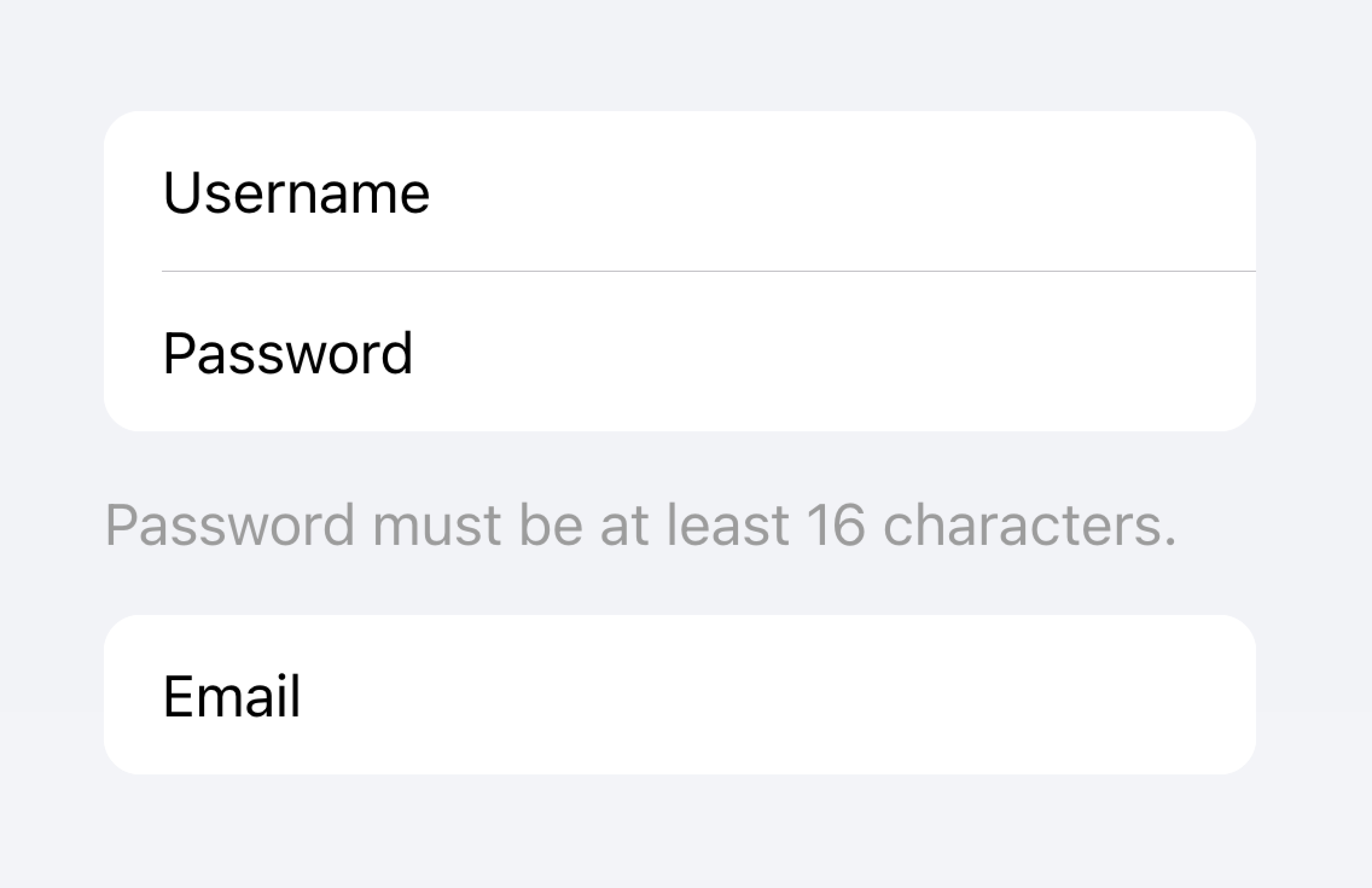
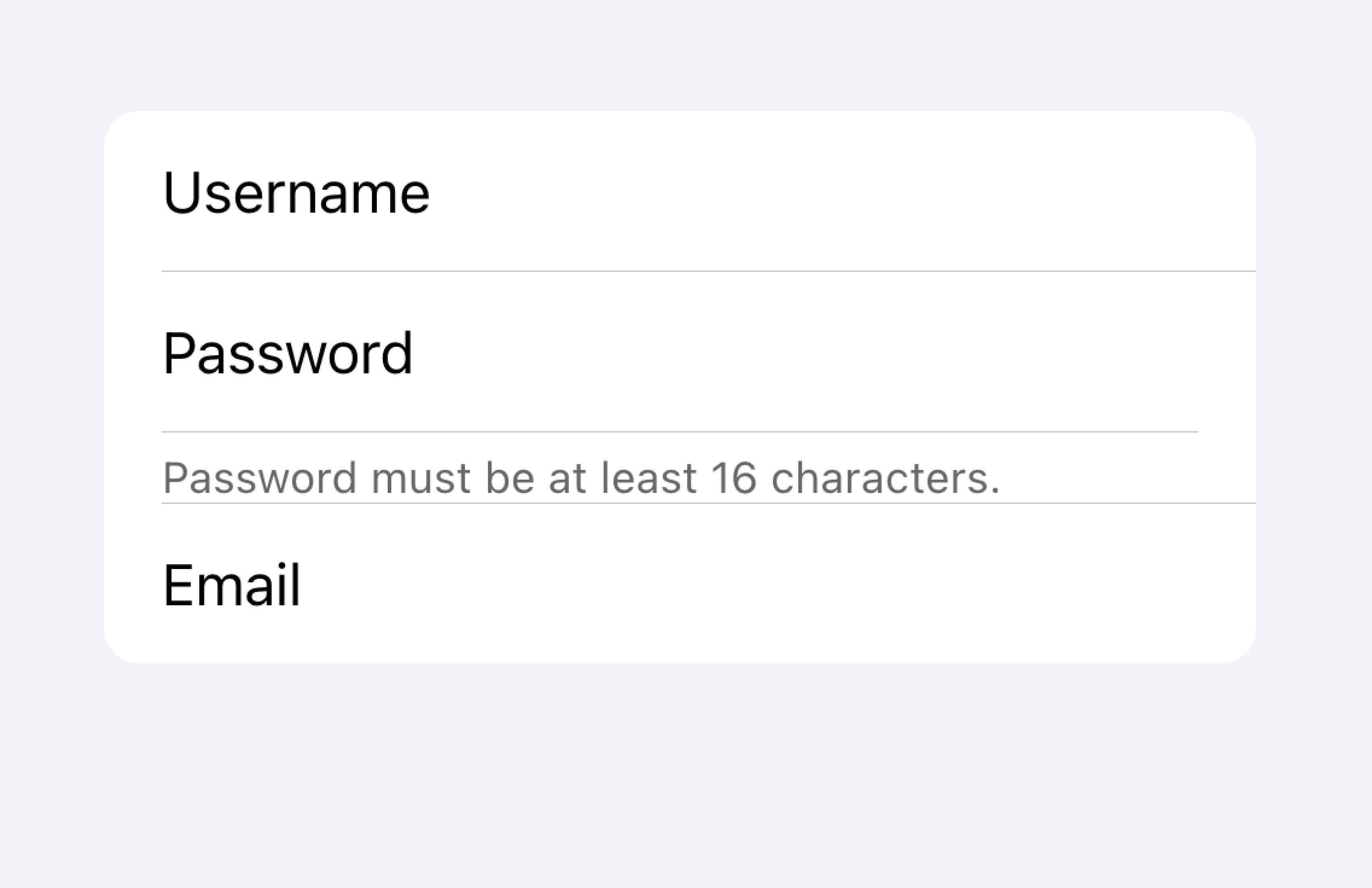
將長文字移至清單外
請勿嘗試將長文字放入項目中
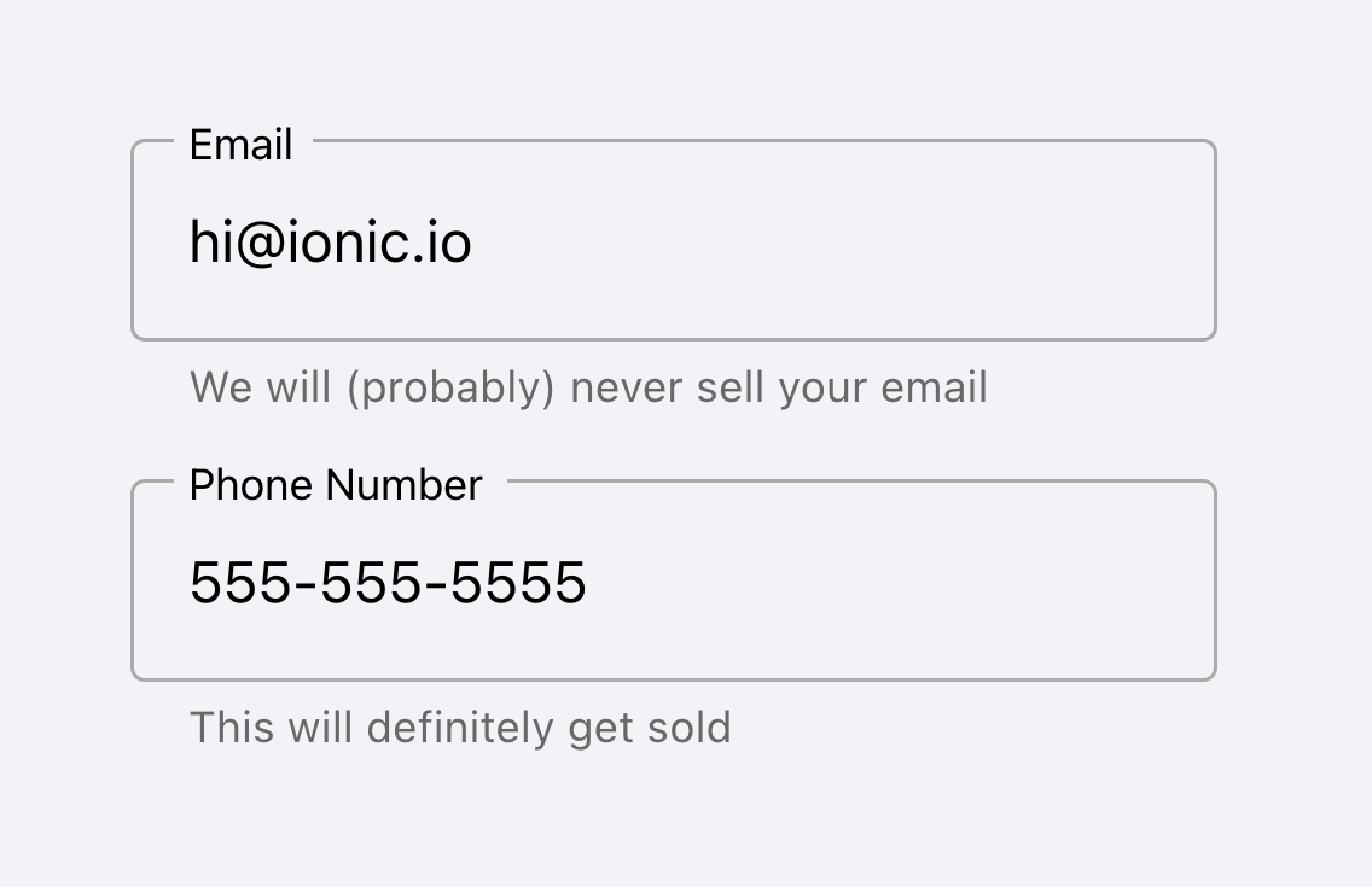
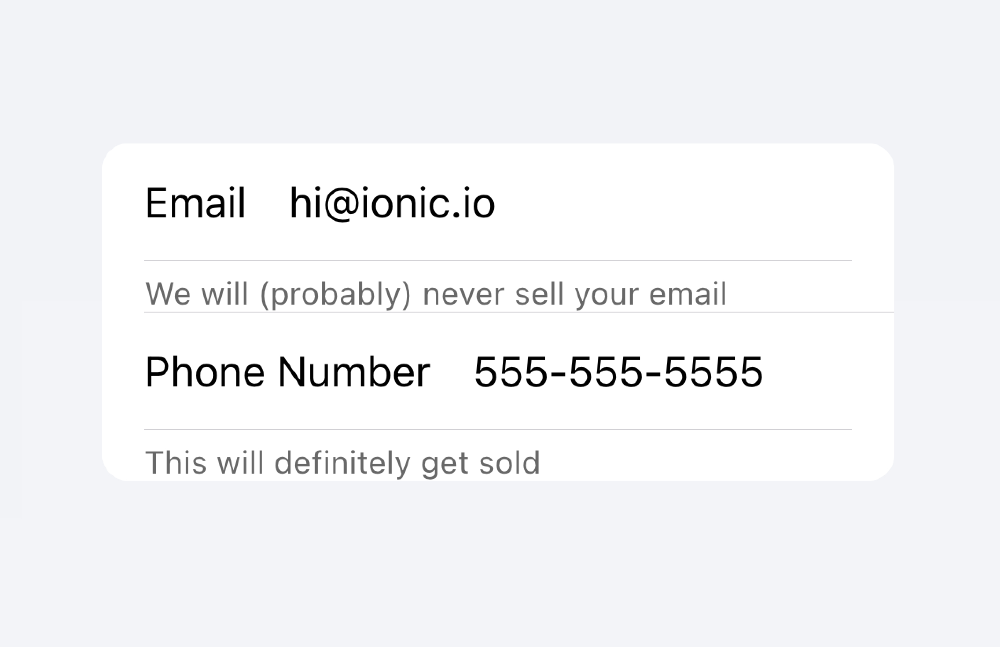
在以下範例中,我們正在建立一個帶有不同類型文字的清單。「名字」和「姓氏」標籤用於表示要在文字輸入中輸入的內容。
切換開關上的「允許通知」標籤下方有其他文字,說明使用者可以停用通知。由於此文字簡短,因此會放置在項目內。
在該清單下方是另一個清單,其中包含一個文字區域,其中含有位於下方的註解,其中包含長文字。文字區域放置在自己的清單中,以明確指出長文字與文字區域相關,而非與任何其他欄位相關。
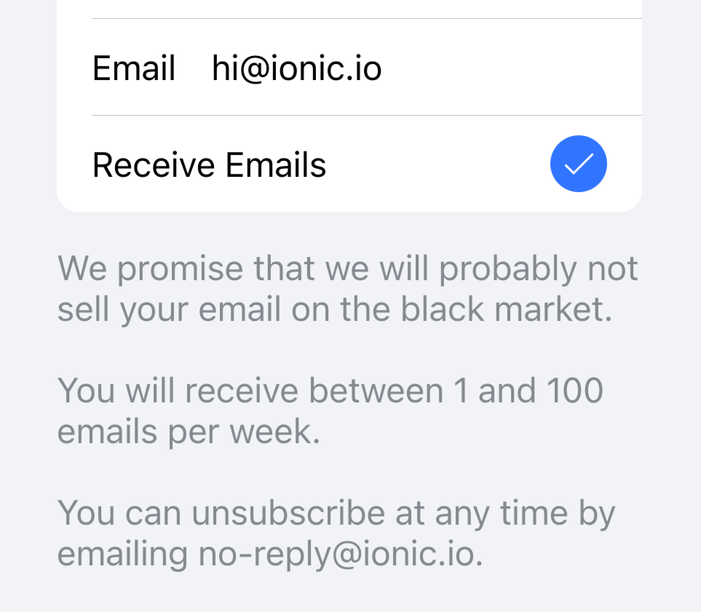
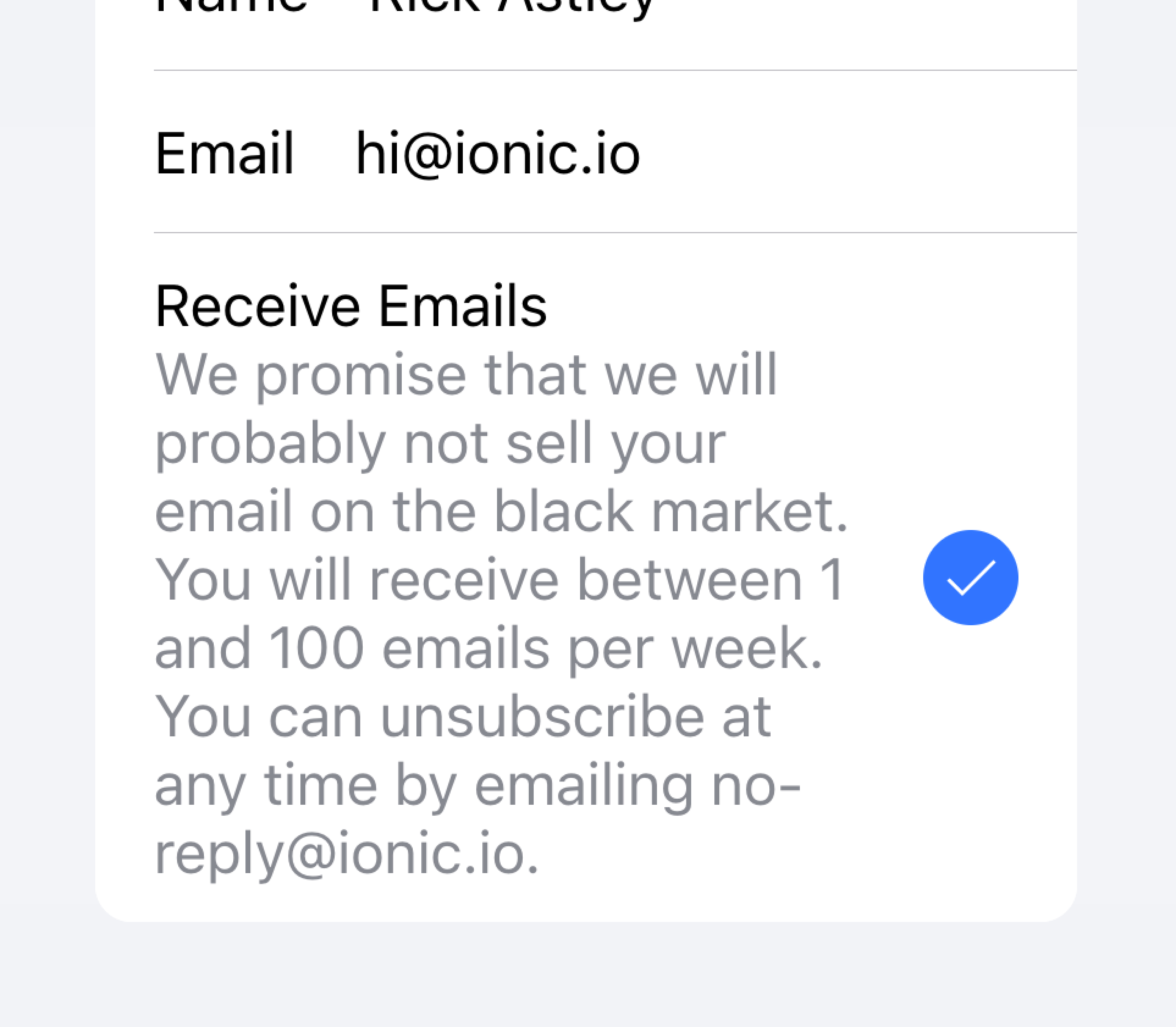
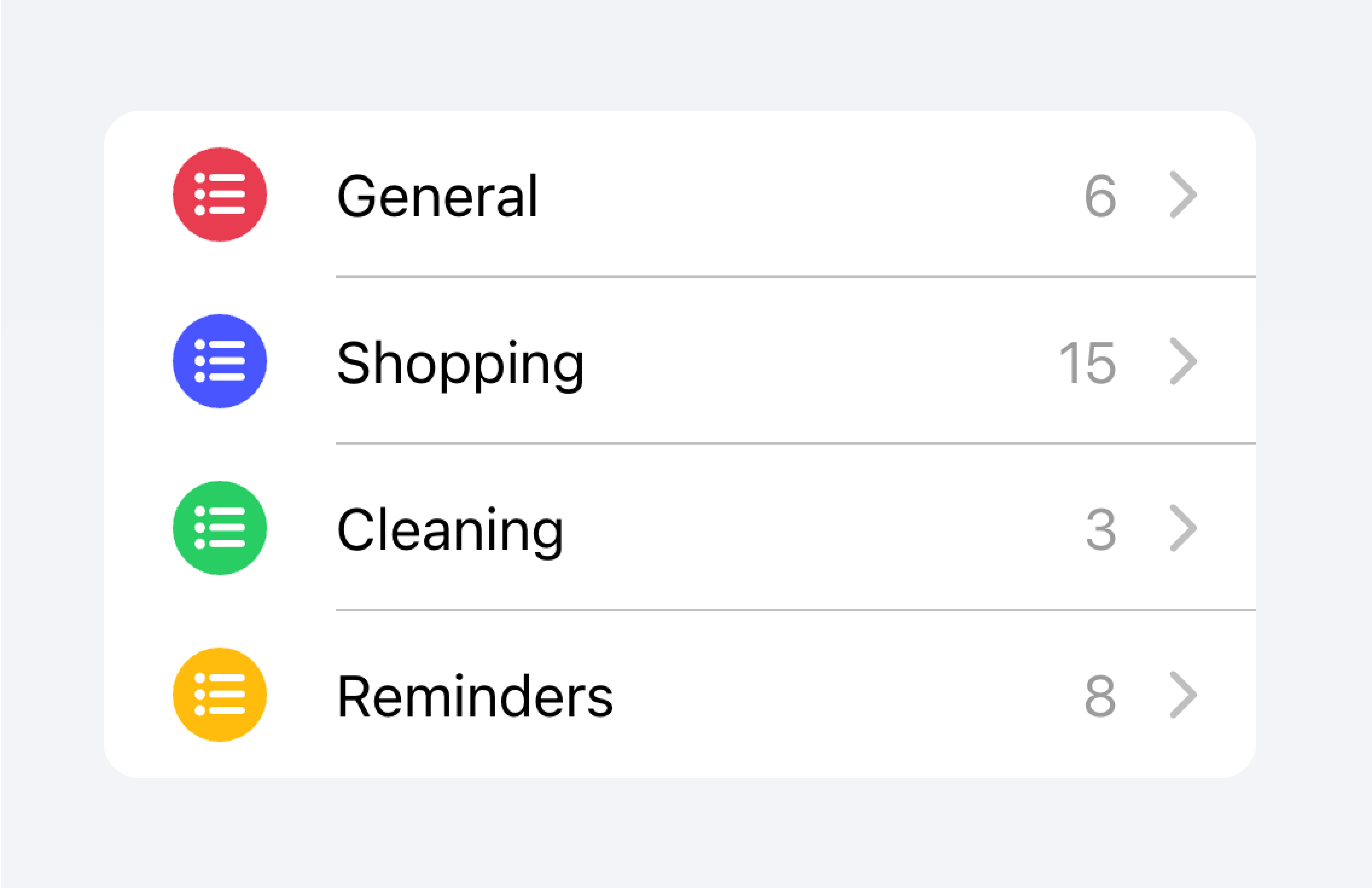
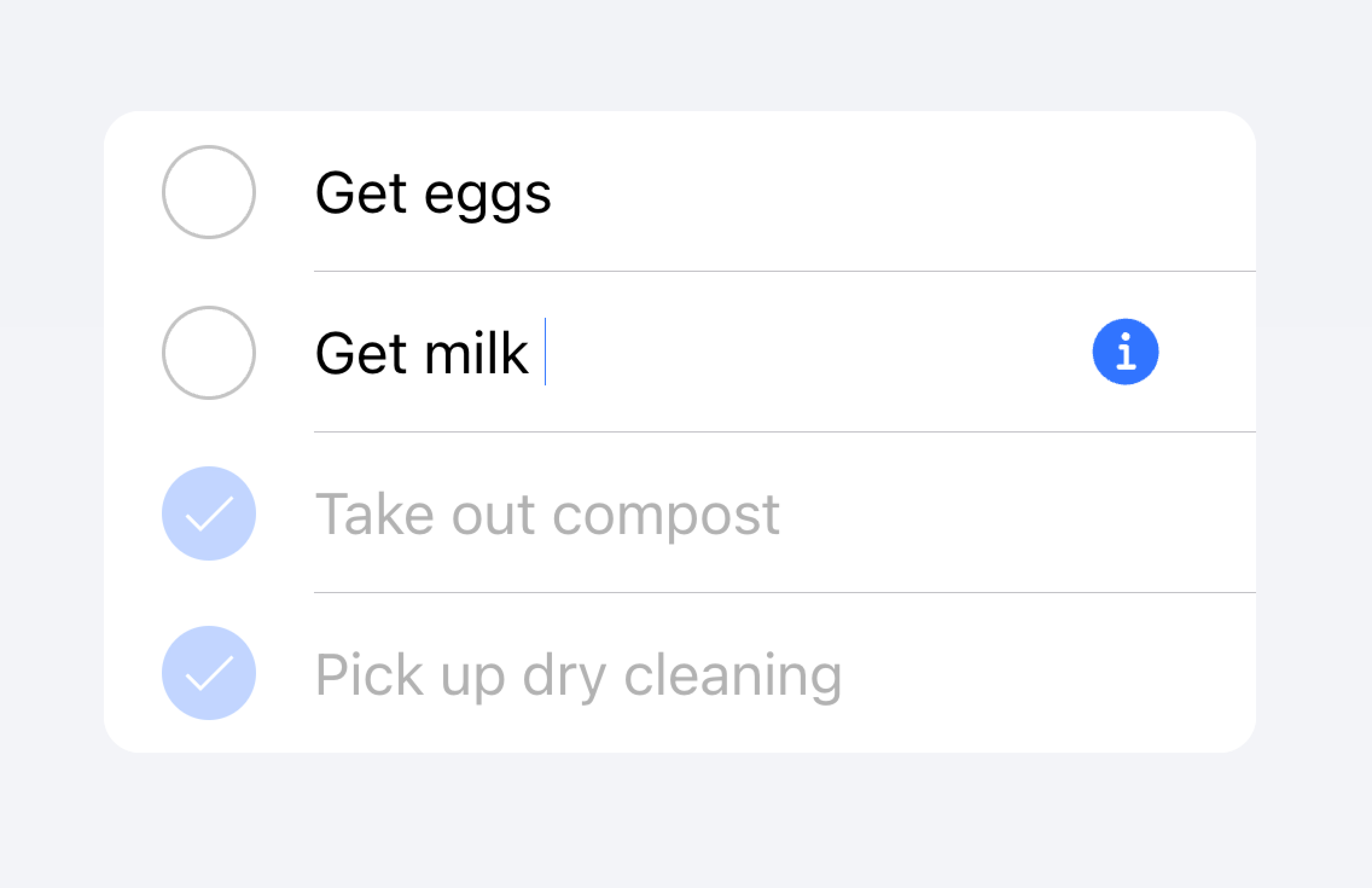
中繼資料
中繼資料會為項目提供其他內容,例如狀態文字或計數。諸如徽章或註解等元件是顯示中繼資料的絕佳方式。
將您包含的中繼資料數量限制為僅限於最相關的資訊。
僅新增最重要的中繼資料
請勿新增過多的中繼資料,因為它可能會讓使用者感到不知所措或困惑。
開發人員也應考慮中繼資料的重要性。根據使用案例,將注意力放在中繼資料上可能對使用者有幫助,也可能分散他們對更重要資訊的注意力。
優先處理最重要的內容。
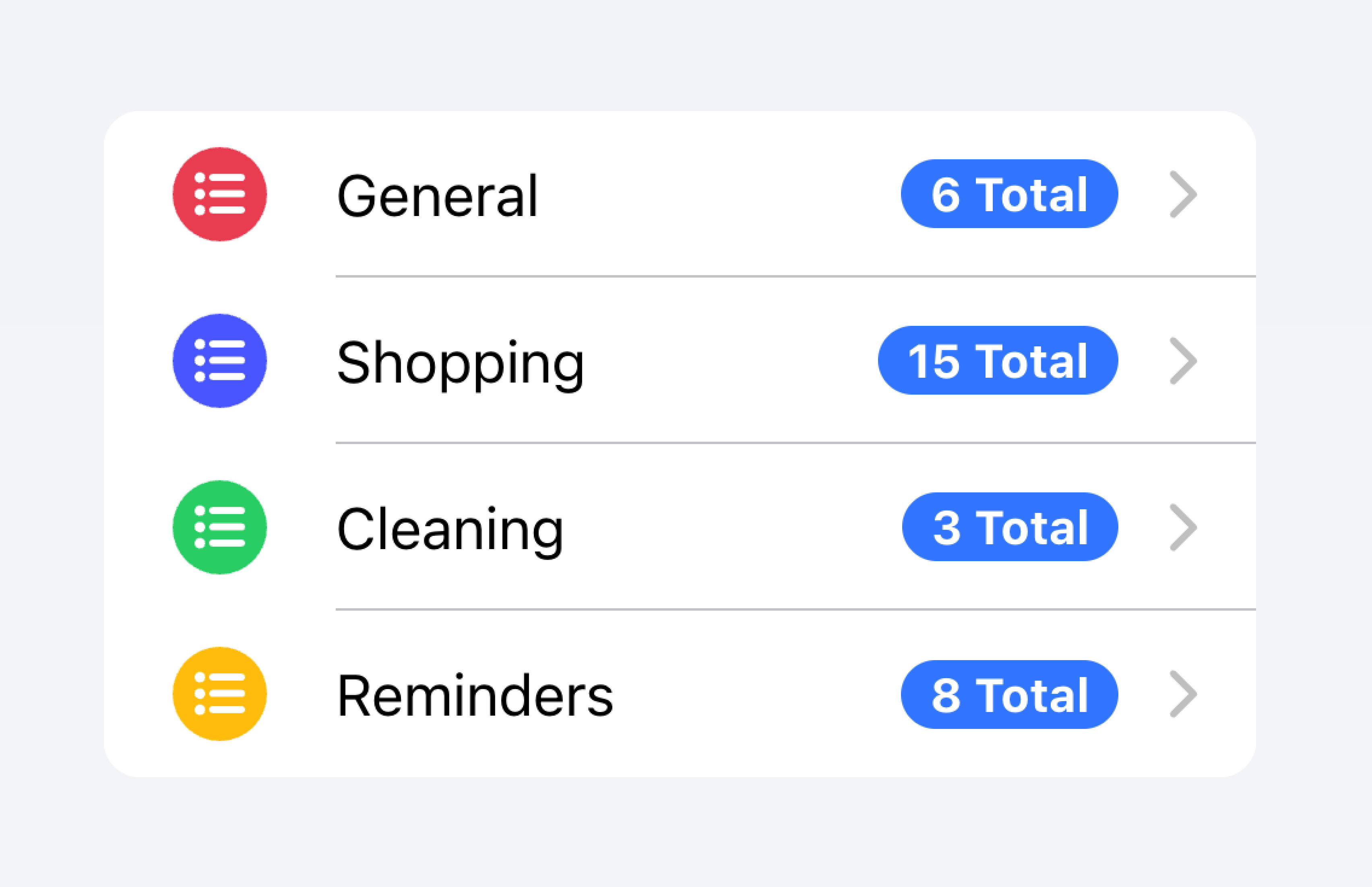
優先處理的中繼資料可能會分散對其他重要內容的注意力。
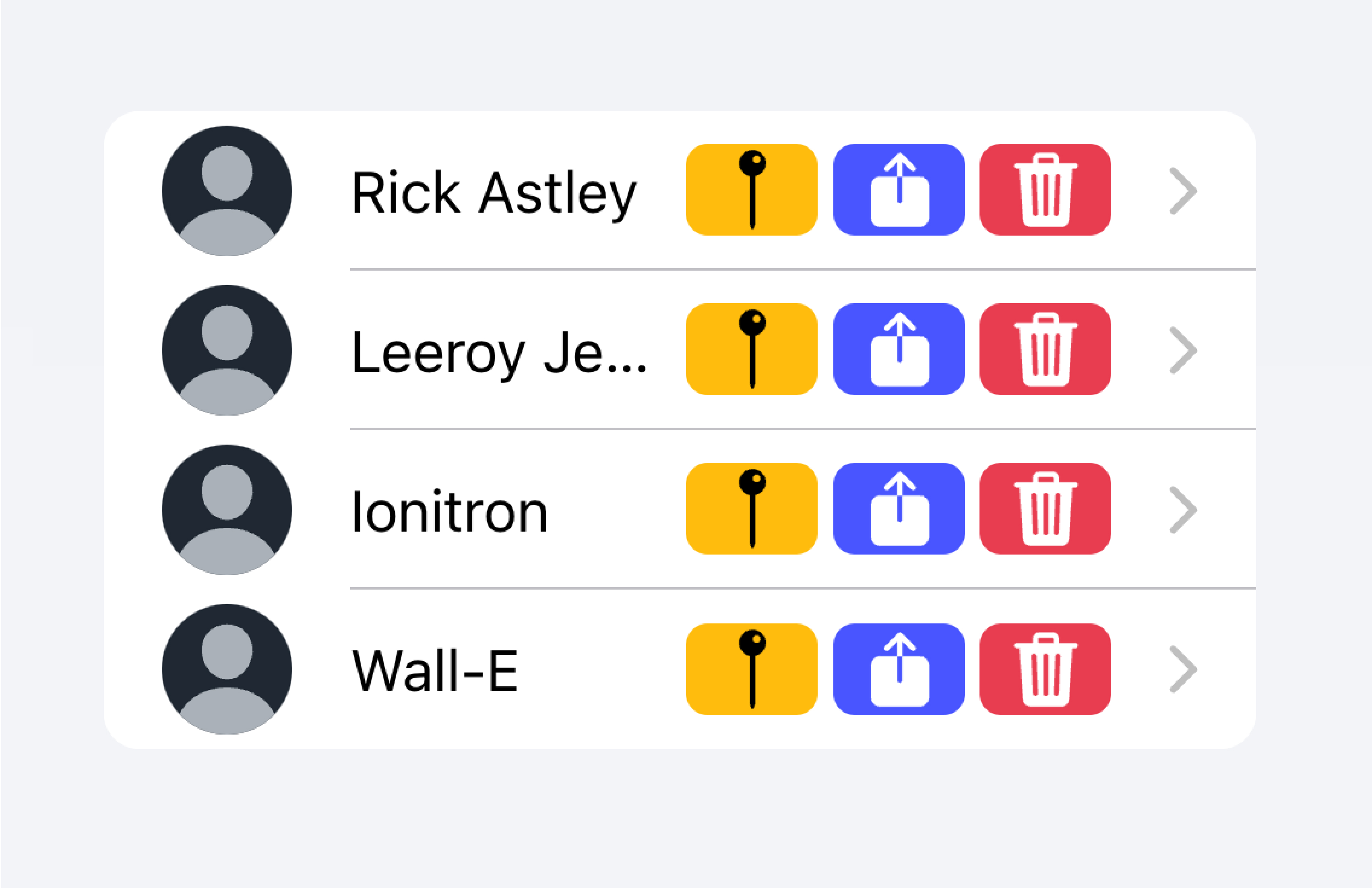
在以下範例中,我們正在建立兩個具有不同類型中繼資料的清單。第一個清單使用註解來顯示每個待辦事項清單中有多少個工作。
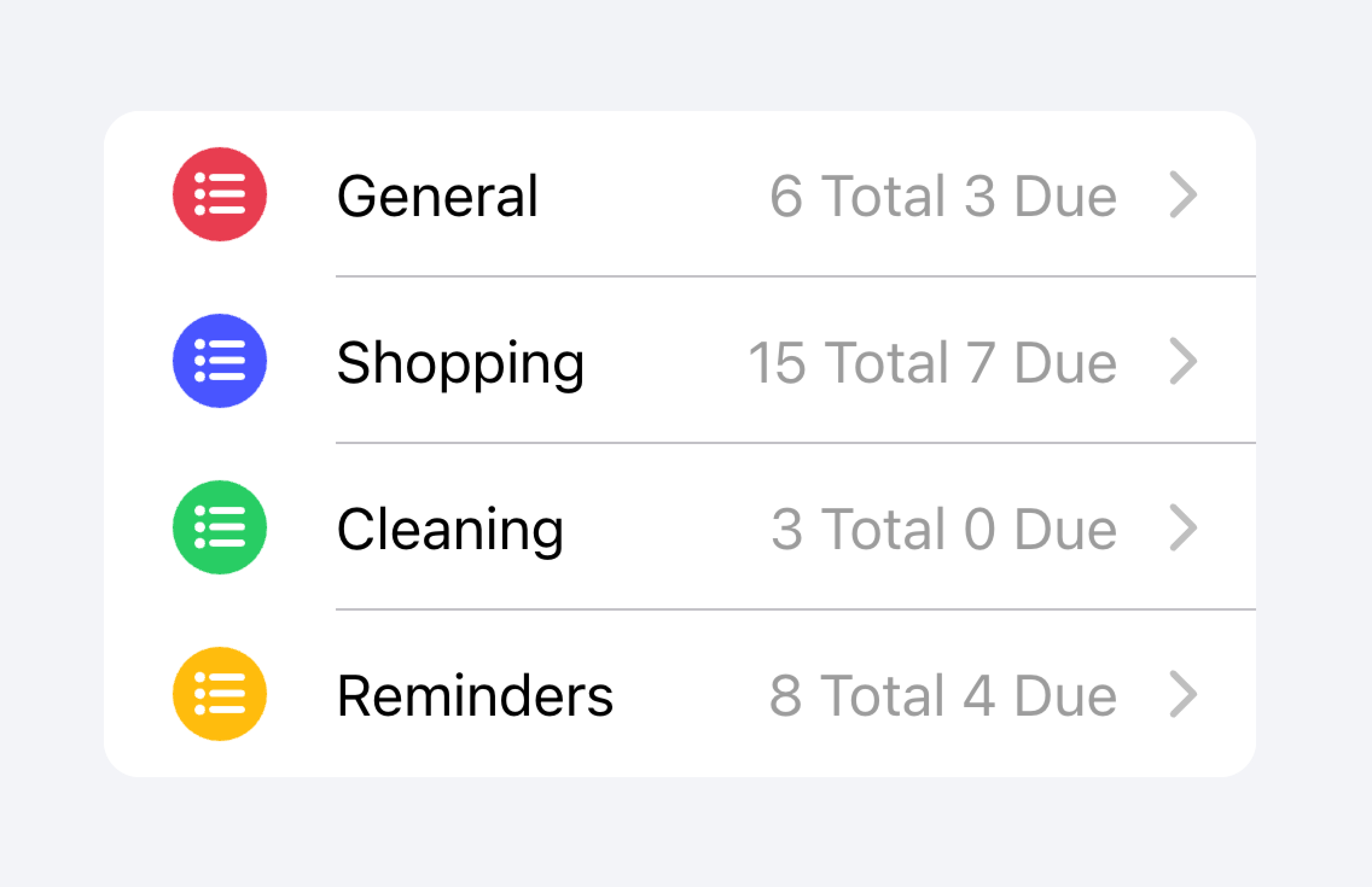
第二個清單模仿 iOS Mail 應用程式來顯示收件匣。此清單利用自訂中繼資料,包括「開始」插槽中的「未讀郵件」指示器,以及「結束」插槽中的時間戳記和自訂詳細資料圖示。「未讀郵件」指示器會以藍色突出顯示,以將使用者的注意力吸引到未讀郵件,而時間戳記則更細微。
動作
動作是互動式元素,當您啟用它們時會執行某些動作。一個項目可以在一行上顯示多個動作。但是,開發人員應確保每個動作的點擊目標都夠大,以便可以使用。
開發人員應避免建立巢狀互動式元素,這可能會中斷螢幕閱讀器的使用者體驗。例如,如果 button 屬性設定為 true,則開發人員應避免在專案的主要內容內新增按鈕。
可以使用項目滑動元件新增動作。動作也可以直接放置在項目內部,而無需使用項目滑動,但這應限制為不超過 2 個動作。
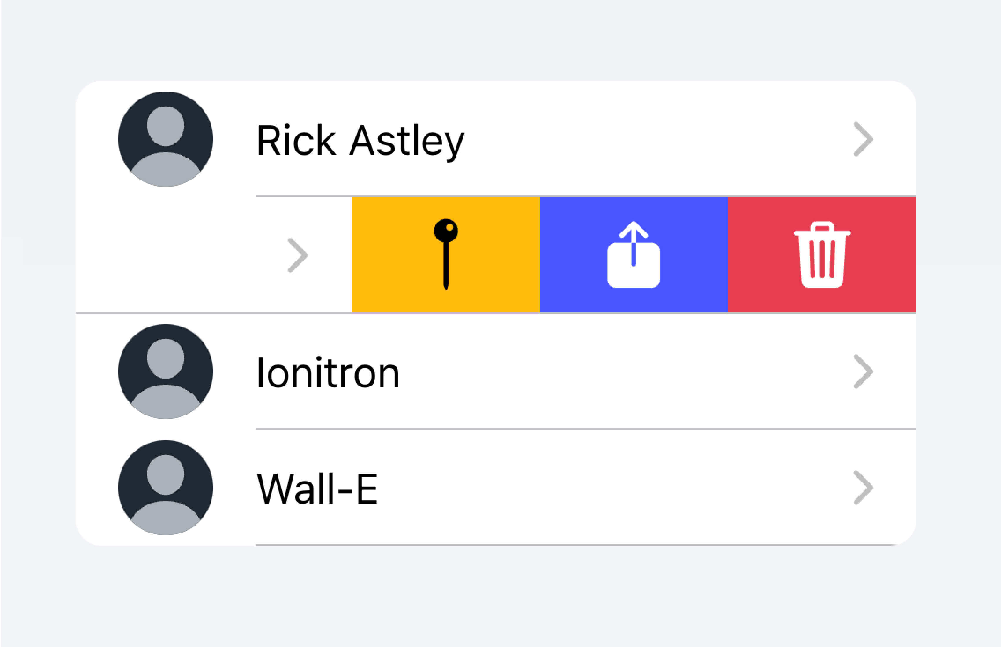
使用項目滑動,透過在項目上滑動來顯示多個動作。
請勿在項目內放置超過 2 個動作。
在以下範例中,我們正在建立一個連絡人清單。每個項目都是一個虛擬按鈕,旨在將您帶到該項目的完整連絡人頁面。每個項目都有其他動作,使用者可以透過在項目上滑動來顯示這些動作。
控制項
控制項是表單元件,例如核取方塊、輸入、單選等等。由於螢幕空間限制,清單中的每個項目最多應有兩個控制項。
諸如輔助文字或字元計數等中繼資料不應在清單視圖中的表單控制項上使用。如果需要此類中繼資料,則表單控制項應放置在清單之外。填滿的輸入是視覺上定義清單外輸入容器的絕佳方式。
將具有中繼資料的輸入放置在清單外。
請勿將輸入的中繼資料放置在清單中。
或者,中繼資料可以放置在清單底部的註解中。
將輸入的中繼資料放置在清單的末尾。
請勿將輸入的中繼資料放置在清單中。
項目通常不應超過兩個控制項。如果需要更多控制項,請考慮在可從項目存取的Modal中新增額外的控制項。
將額外的控制項移至可從項目存取的子選單。
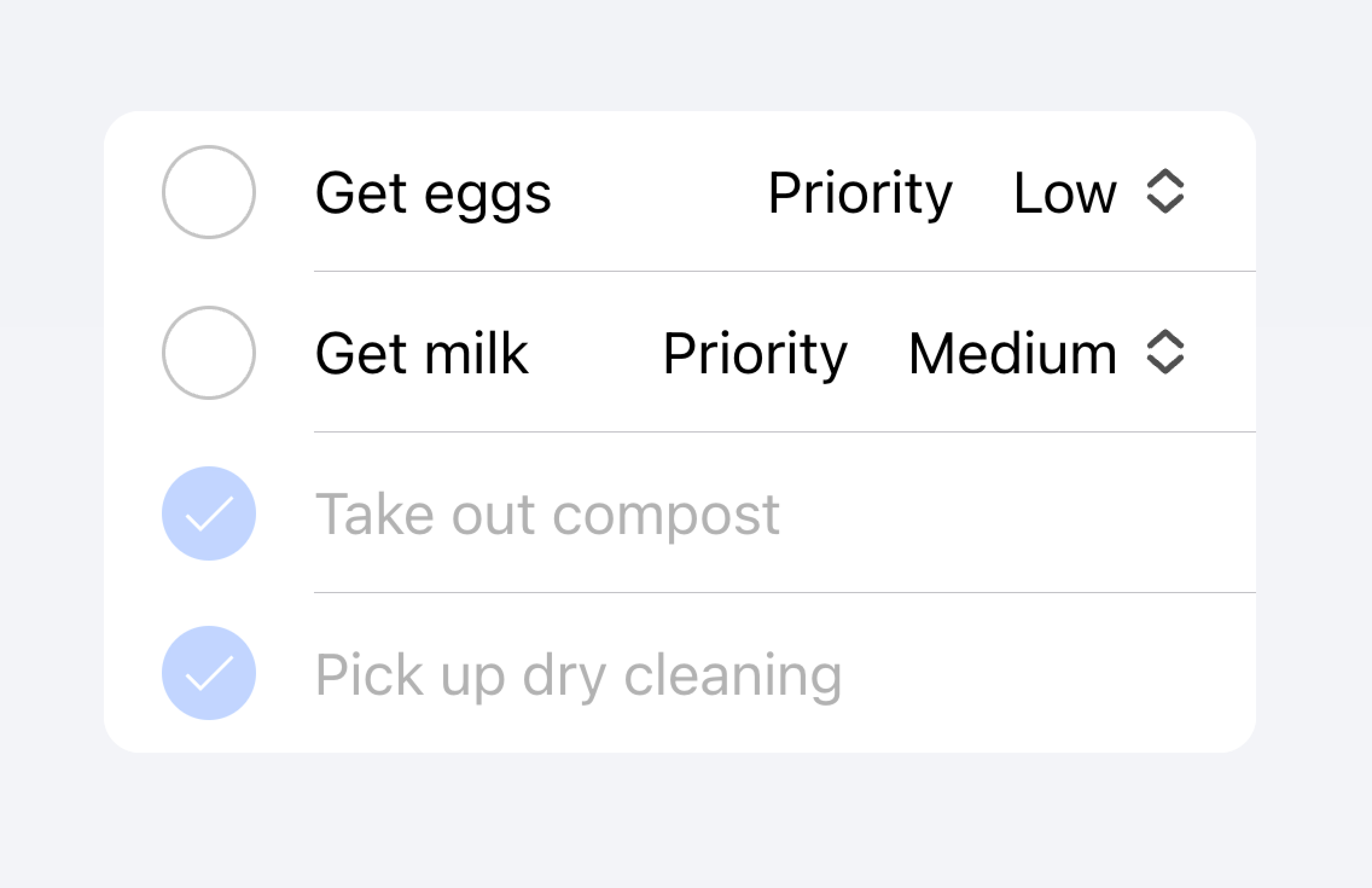
請勿在一個項目中使用超過兩個控制項。
在以下範例中,我們正在建立待辦事項清單。每個項目都有一個核取方塊和一個輸入欄位。核取方塊讓使用者將任務標記為完成,而輸入欄位讓使用者變更任務名稱。
可點擊項目
如果項目設定了 href 或 button 屬性,則該項目被視為「可點擊」。可點擊項目有一些視覺差異,表示它們可以互動。例如,可點擊項目在 md 模式下啟用時會產生漣漪效果,在 ios 模式下啟用時會有醒目提示,並且在 ios 模式下預設會有詳細箭頭。
詳細箭頭
預設情況下,可點擊項目會在 ios 模式下顯示向右箭頭圖示。若要隱藏可點擊元素上的向右箭頭圖示,請將 detail 屬性設定為 false。若要在不自然顯示向右箭頭圖示的項目上顯示該圖示,請將 detail 屬性設定為 true。
項目線條
預設情況下,項目會顯示一個內嵌的底部邊框。邊框左側有邊距,並且不會出現在 "start" 插槽中插入的任何內容下方。可以將 lines 屬性修改為 "full" 或 "none",這會分別顯示全寬邊框或無邊框。
項目中的按鈕
項目內的按鈕樣式會比項目外部的按鈕樣式小。若要使按鈕大小與項目外部的按鈕大小相符,請將 size 屬性設定為 "default"。
項目輸入欄位
主題設定
色彩
CSS 陰影部分
CSS 自訂屬性
準則
下列準則將有助於確保您的清單項目易於理解和使用。
- 項目應僅在清單內使用。
- 清單內的項目應以一致的格式呈現。例如,如果您的項目呈現裝飾性圖示,則圖示在項目之間應以相同的方式定位。
- 項目絕不應呈現巢狀互動元素。當使用巢狀互動元素時,螢幕閱讀器無法選取正確的互動元素。例如,避免將按鈕放在具有
button="true"的ion-item內。 - 正確使用內容類型。Item 元件設計為清單中的一列,不應用作一般用途的容器。
協助工具
鍵盤互動
當符合下列任何條件時,<ion-item> 會有下列鍵盤互動
button屬性設定為"true",呈現原生<button>元素。- 設定了
href屬性,呈現原生<a>元素。 - 設定了
routerLink屬性,呈現原生<a>元素。
| 按鍵 | 說明 |
|---|---|
| Tab | 將焦點移至下一個可聚焦的元素。 |
| Shift + Tab | 將焦點移至上一個可聚焦的元素。 |
按鈕
當 <ion-item> 呈現原生 <button> 元素時,鍵盤互動會遵循與按鈕角色相同的模式
| 按鍵 | 說明 |
|---|---|
| Enter | 啟用項目,觸發其 click 事件。如果項目在表單內,且 type 設定為 "submit",則會提交表單。 |
| Space | 啟用項目,觸發其 click 事件。即使項目的 type 為 "submit",也不會提交表單。 |
錨點
當 <ion-item> 呈現原生 <a> 元素時,鍵盤互動會遵循與連結角色相同的模式
| 按鍵 | 說明 |
|---|---|
| Enter | 啟用項目,導覽至連結的頁面或將焦點移至頁內目標。 |
屬性
button
| 說明 | 如果為 true,則會呈現按鈕標籤,且項目可點擊。 |
| 屬性 | button |
| 類型 | 布林值 |
| 預設值 | false |
color
| 說明 | 要從應用程式的調色盤使用的色彩。預設選項為:"primary"、"secondary"、"tertiary"、"success"、"warning"、"danger"、"light"、"medium" 和 "dark"。如需有關色彩的詳細資訊,請參閱主題設定。 |
| 屬性 | color |
| 類型 | "danger" | "dark" | "light" | "medium" | "primary" | "secondary" | "success" | "tertiary" | "warning" | string | undefined |
| 預設值 | undefined |
detail
| 說明 | 如果為 true,項目上會出現詳細箭頭。除非 mode 為 ios 且存在 href 或 button 屬性,否則預設為 false。 |
| 屬性 | detail |
| 類型 | 布林值 | undefined |
| 預設值 | undefined |
detailIcon
| 說明 | 當 detail 設定為 true 時要使用的圖示。 |
| 屬性 | detail-icon |
| 類型 | 字串 |
| 預設值 | chevronForward |
disabled
| 說明 | 如果為 true,使用者無法與項目互動。 |
| 屬性 | disabled |
| 類型 | 布林值 |
| 預設值 | false |
download
| 說明 | 這個屬性會指示瀏覽器下載 URL,而不是導覽至該 URL,因此系統會提示使用者將其儲存為本機檔案。如果屬性有值,則會將該值用作「儲存」提示中的預先填入檔案名稱(使用者仍然可以變更檔案名稱,如果他們想要的話)。 |
| 屬性 | download |
| 類型 | 字串 | undefined |
| 預設值 | undefined |
href
| 說明 | 包含超連結指向的 URL 或 URL 片段。如果設定此屬性,則會呈現錨點標籤。 |
| 屬性 | href |
| 類型 | 字串 | undefined |
| 預設值 | undefined |
lines
| 說明 | 項目底部邊框應如何顯示。 |
| 屬性 | lines |
| 類型 | "full" | "inset" | "none" | undefined |
| 預設值 | undefined |
mode
| 說明 | 模式決定要使用哪個平台樣式。 |
| 屬性 | mode |
| 類型 | "ios" | "md" |
| 預設值 | undefined |
rel
| 說明 | 指定目標物件與連結物件之間的關係。該值是以空格分隔的連結類型清單。 |
| 屬性 | rel |
| 類型 | 字串 | undefined |
| 預設值 | undefined |
routerAnimation
| 說明 | 當使用路由器時,它指定使用 href 導覽至另一個頁面時的轉換動畫。 |
| 屬性 | undefined |
| 類型 | ((baseEl: any, opts?: any) => Animation) | undefined |
| 預設值 | undefined |
routerDirection
| 說明 | 當使用路由器時,它指定使用 href 導覽至另一個頁面時的轉換方向。 |
| 屬性 | router-direction |
| 類型 | "back" | "forward" | "root" |
| 預設值 | 'forward' |
target
| 說明 | 指定要顯示連結 URL 的位置。僅在提供 href 時適用。特殊關鍵字:"_blank"、"_self"、"_parent"、"_top"。 |
| 屬性 | target |
| 類型 | 字串 | undefined |
| 預設值 | undefined |
type
| 說明 | 按鈕的類型。僅在存在 onclick 或 button 屬性時使用。 |
| 屬性 | type |
| 類型 | "button" | "reset" | "submit" |
| 預設值 | 'button' |
事件
此元件沒有可用的事件。
方法
此元件沒有可用的公開方法。
CSS 陰影部分
| 名稱 | 說明 |
|---|---|
detail-icon | 項目的 Chevron 圖示。僅在 detail="true" 時適用。 |
native | 包裝所有子元素的原生 HTML 按鈕、錨點或 div 元素。 |
CSS 自訂屬性
- iOS
- MD
| 名稱 | 說明 |
|---|---|
--background | 項目的背景 |
--background-activated | 按下時項目的背景。注意:設定此屬性會干擾 Material Design 的漣漪效果。 |
--background-activated-opacity | 按下時項目背景的不透明度 |
--background-focused | 使用 Tab 鍵聚焦時項目的背景 |
--background-focused-opacity | 使用 Tab 鍵聚焦時項目背景的不透明度 |
--background-hover | 滑鼠懸停時項目的背景 |
--background-hover-opacity | 滑鼠懸停時項目背景的不透明度 |
--border-color | 項目邊框的色彩 |
--border-radius | 項目邊框的半徑 |
--border-style | 項目邊框的樣式 |
--border-width | 項目邊框的寬度 |
--color | 項目的色彩 |
--color-activated | 按下時項目的色彩 |
--color-focused | 使用 Tab 鍵聚焦時項目的色彩 |
--color-hover | 滑鼠懸停時項目的色彩 |
--detail-icon-color | 項目詳細資訊圖示的色彩 |
--detail-icon-font-size | 項目詳細資訊圖示的字型大小 |
--detail-icon-opacity | 項目詳細資訊圖示的不透明度 |
--inner-border-width | 項目內部邊框的寬度 |
--inner-box-shadow | 項目內部的陰影 |
--inner-padding-bottom | 項目內部的底部內距。 |
--inner-padding-end | 如果方向是從左到右,則為項目內部的右邊內距;如果方向是從右到左,則為左邊內距。 |
--inner-padding-start | 如果方向是從左到右,則為項目內部的左邊內距;如果方向是從右到左,則為右邊內距。 |
--inner-padding-top | 項目內部的頂部內距。 |
--min-height | 項目的最小高度。 |
--padding-bottom | 項目的底部內距。 |
--padding-end | 如果方向是從左到右,則為項目的右邊內距;如果方向是從右到左,則為左邊內距。 |
--padding-start | 如果方向是從左到右,則為項目的左邊內距;如果方向是從右到左,則為右邊內距。 |
--padding-top | 項目的頂部內距。 |
--ripple-color | 項目漣漪效果的顏色。 |
--transition | 項目的過渡效果。 |
插槽
| 名稱 | 說明 |
|---|---|
| `` | 如果沒有指定插槽,內容會放置在指定的插槽之間。 |
end | 在 LTR(從左到右)方向中,內容會放置在項目文字的右側;在 RTL(從右到左)方向中,則會放置在左側。 |
start | 在 LTR(從左到右)方向中,內容會放置在項目文字的左側;在 RTL(從右到左)方向中,則會放置在右側。 |